What components does this change affect?
This change affects all implementations of the checkbox component.
What changed
Updated checkbox focus styling to improve visibility of the keyboard focus indicator when navigating using the Tab key.
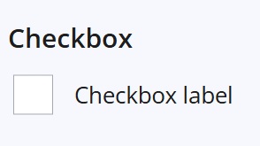
Before: no focus state
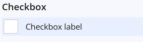
After: prominent focus state
Why this change was made
This update improves accessibility by making keyboard focus states visible when navigating through the checkbox component using the Tab key.
Benefits include:
- Improved keyboard accessibility – makes it easier to identify which checkbox currently has focus when tabbing through a page
- Supports WCAG 2.2 guidance – improves visibility of focus indicators for keyboard users
- Better usability – helps users navigating with a keyboard or assistive technologies interact with checkboxes more confidently
Recommended checks for consuming teams
After updating your Design System packages, we recommend reviewing checkbox focus behaviour in your application.
Areas worth checking:
- focus state is clearly visible when tabbing to a checkbox
Summary
This change improves keyboard accessibility and focus visibility for checkbox components.
No functional or data changes are expected.
Internal reference
Design System internal reference: 79956