Primary logo
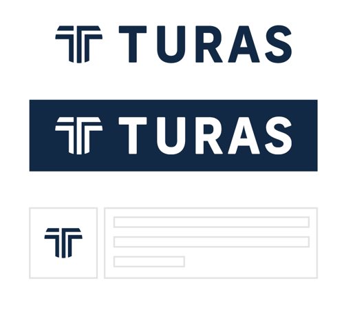
The primary Turas logo combines the logo mark, a stylised ‘T’ made up of roads representing the user journey and a logo type in the typeface ‘Frank New’. The primary logo should be used in full wherever possible.
Contrast
The monotone white version of the primary logo should be used for increased accessibility on darker backgrounds.
Logo mark
The logo mark may be used on its own where space is very limited and where the Turas identity has already been firmly established through the use of the primary logo.
For access to logo files and guidance please contact design_support@nes.scot.nhs.uk.
Exclusion zone
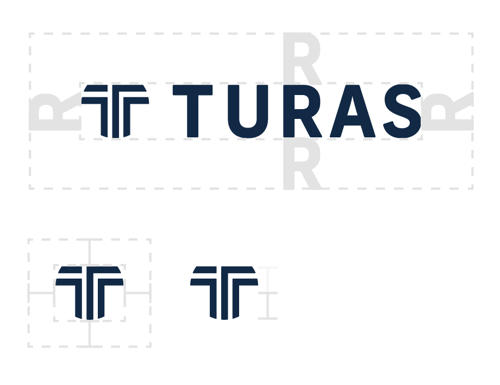
It is important to give the logo adequate space when placed in context. You can use the Turas ‘R’ to measure the minimum clear space between the logo and other elements. The exclusion zone is equal to the x height of the logo type.
If the logo mark is able to be used on its own the exclusion zone is equal to half the x height of the logo mark.
Minimum sizing
To maintain clarity on a small scale, keep the primary logo height above 35px (digital) and 6mm (print).
Do:
- scale any partner text to 100% of the height of the logo
- use the ‘T’ mark without the ‘Turas’ text for social media and favicons
- use the original logo files to ensure the best quality and clarity
Do not:
- colour the logo in a swatch outside the Turas colour system
- create a new version of the logo
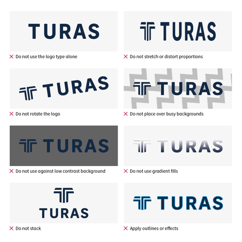
How not to use the Turas logo